My screen can show colours more intensely than any printer. If I edit an image to look its best on the screen, it loses details on the printer and looks muddied. Conversely, if I edit a photo for the printer, it does not unfold its full potential on the screen – more would be possible. My first decision when editing a photo is therefore: What am I editing it for? Do I intend to show it on the screen or do I want to print it? It also makes a difference whether I want to show it on the Internet or on my own screen and on what kind of printer and paper it will be printed. In the past, I didn’t think about these things and I just edited my images so that they looked good on the screen right in front of me. If I wanted to print them, I had to take back several colours that the printer could not show. When I did this, I had the feeling that I was making the image worse again. Nowadays, when I edit a photo, if I already know that I want to print it, I edit it directly for output to a printer.
Episode 11
Soft proofing for print simulation
Colour management for photographers
Soft proofing is used to specifically edit an image for a different output device than the screen right in front of you. In soft proofing, the image processing programme takes the profiles of the monitor and printer (or other output device) and tries to display the image as it will be output later on the output device. The soft proofing programs look at the printer profile and determine what the colours are likely to look like. Colours that the printer cannot print are changed to printable colours. As a result, intense colours become less intense in soft proofing (and in the print) and, as we saw in episode 7, the image loses details in these areas.
The higher the quality of the screen and profiles, the better soft proofing works. It will never be perfect, of course, because unlike screens, prints do not light up from behind. Cheap screens can be problematic because they cannot display many colours that a good printer can print. On such a screen it is difficult to predict how these areas, which the screen cannot display, will look later when printed. Therefore, in my opinion, a good screen is the most important tool when you want to print images.
Improving with every edit
When I edit an image for multiple output formats, I prefer to start with the worst output quality. In other words, the first thing I do is edit an image for offset printing in CMYK, as this has the smallest gamut. This is followed by the version for high-quality colour printers with more than four colours, then sRGB for the web and only at the end do I attempt the version for my own screen. In this way, I improve the image further from profile to profile.
In the past, I used to do it the other way round and edit an image first for my own screen. When I edited the image afterwards for the printer, I always had to remove colours and saturation. I felt I had to weaken the image bit by bit until it fitted the profile. I found this approach rather frustrating. Nowadays, if I’ve already edited an image so that it is ready for my screen and then prepare it for a printer, I tend to reduce the editing of the picture a lot beforehand. I simply enjoy making a picture more intense bit by bit rather than taking the intensity out.
Setting up printer profiles
Once you have decided on your printer and paper, you will need to obtain and install the appropriate profile for soft proofing. If you have installed the printer driver for a photo printer, it will have also installed profiles for the manufacturer’s paper. If you have created a profile for your printer, as described in episode 9, you will probably have already installed it. Otherwise, you will have to download a suitable profile from the Internet.
I have my prints printed by a local provider with an Epson Stylus Pro on Hahnemühle paper, so I need a colour profile for these printer/paper combinations. In this case it’s easy, as Hahnemühle offers ready-made profiles for their paper types and common printers for download on their website. Some printing companies also offer profiles for their printers and papers, some of which are self-made and some of which are ready-made profiles from the equipment or paper suppliers.
Ready-made profiles are not bad. They may not be perfect as small differences do arise between two identical printers, but they are sufficient for home use. Deviations in series production have reduced as printers have become more modern and improved in quality. This means that you can achieve good results without having to create a profile for the one specific printer. Of course, your results will still be better if you have a tailor-made profile created for your printer, as described in episode 9.
If you have downloaded a profile, an installation guide is usually also included. To install under Windows, all you need to do is double-click the profile file. To install under MacOS, you need to drag the profile into the /Library/ColorSync/Profiles folder. You usually need to restart the image processing programme to make the profile available.
Soft proofing in Lightroom
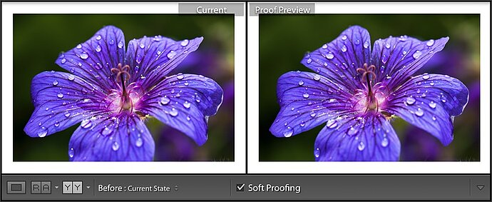
Lightroom has a very sophisticated soft proofing tool. It is located in the Develop module, where you activate it by pressing the [S] key or by clicking the word Soft Printing in the toolbar (that can be shown or hidden by pressing [T]). When soft proofing is enabled, Lightroom displays your image on a paper-white background, assuming that the photo is to be printed on white paper. If you plan to print it on a dark background, you can adjust the colour by right-clicking the background.
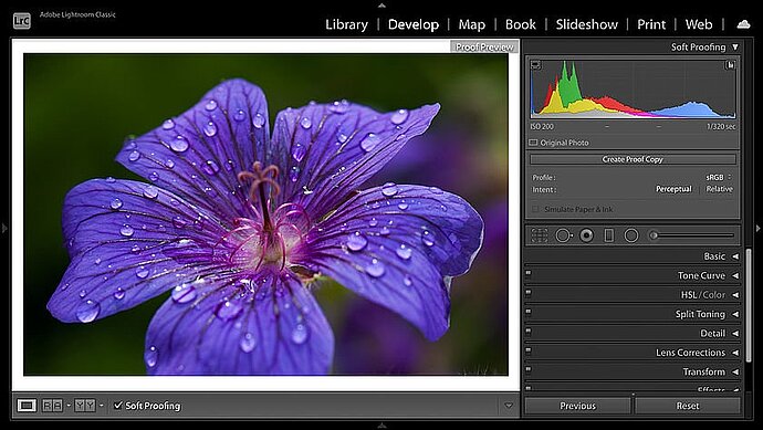
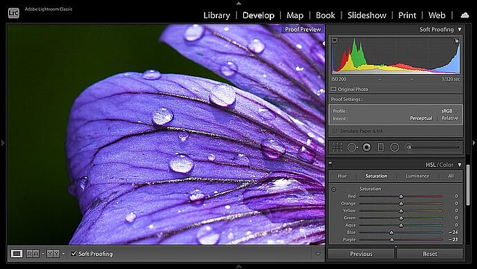
The soft proofing preview in Lightroom’s Develop module
Setting up soft proofing
The first and most important action in soft proofing is to choose the right profile for your printer and paper. To do this, click the profile.
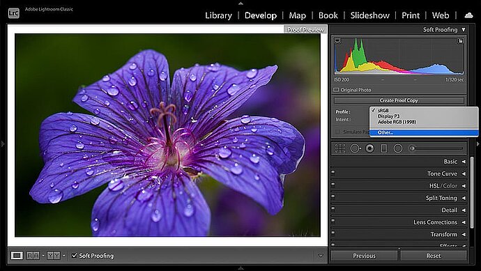
Profile popup in soft proofing
When first used, only sRGB and Adobe RGB are shown in this profile pop-up. When you click Other... Lightroom opens a profile selection, where you can choose from the installed profiles that should be available for selection in soft proofing. Depending on the installed printer drivers, a large number of profiles may be available here. To keep a clear overview of the selection in the soft proofing process itself, it makes sense to choose only those printers and papers that you actually use and not select the others.
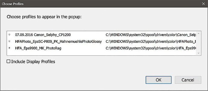
Activating profiles for soft proofing
Once this is set, you can select the profile for your required output in the Profile pop-up in the Soft Proofing dialogue. Once you have a suitable profile and have activated soft proofing you can edit your image as usual.
Creating a virtual copy for the proof
Once you have enabled soft proofing and edit your image for the first time, you will be asked if you want to create an extra virtual copy for this output or whether you want to make the current image a proof copy:
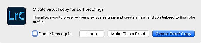
Lightroom allows you to create a virtual copy for the soft proof
If an image is edited differently for several types of output, it makes sense to create a separate virtual copy of the image for each output type so that you can access all the different versions later. If you click the Create Proof Copy button, Lightroom creates a virtual copy and enters the profile as the copy name. This means that you will have both the original photo as well as the proof version created for this printer/paper combination in the catalogue later on and can access both at any time. If you select Make This A Proof instead, Lightroom will turn the active image into a soft proof.
If you have already finished editing your image, you should select Create Proof Copy to keep a copy with the original edits and also obtain a copy for the selected output. If, on the other hand, I am editing an image for the first time, I select Make This A Proof and only make copies for other outputs later on.
Tips for editing in soft proofing
Even in soft proofing, the contrast of the screen is stronger than that of your paper. To make the proof preview match the paper better, you could tick the Simulate Paper and Ink checkbox. Lightroom will then reduce the contrast of the display. I do not use this option because we are used to different contrasts on the screen.
Soft proofing offers a few practical aids to help you edit your image. For example, you can compare the soft proof image with what is possible on the screen. This is particularly useful if you have already edited the image for the screen and only adapt it later for print output. To call up this comparison, press the [Y] key to display the screen version next to the soft proof.
To compare, you can display the original image next to the proof
This allows you to easily see what sacrifices you will need to make when you print; however, it does not really help you. This comparison is especially useful if you want to see whether details are visible in the screen version that are lost in the print output.
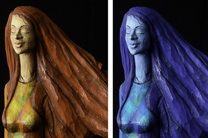
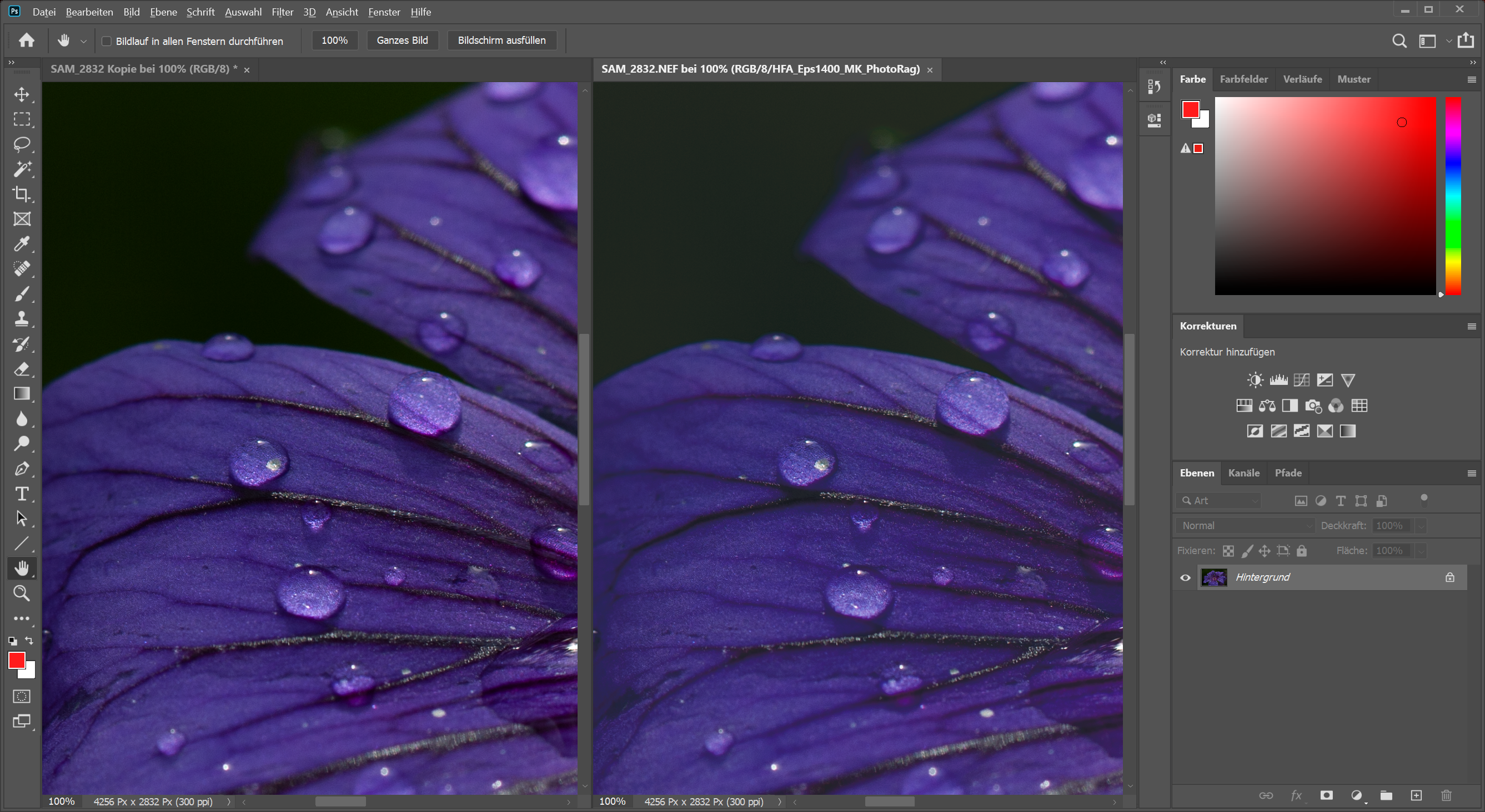
To show what can be lost during printing, I’ve zoomed into the image so that you can see more details on the screenshots. Left: the original on the screen. Right: The version as it would appear with my profile for an Epson Stylus Pro 9800 on Hahnemühle Photo Rag paper. Since Photo Rag is a matt paper, the differences are quite significant. If I were to use glossy paper, the colours would be almost the same as on the original when printed on a good printer, but this would be uninteresting as an example for soft proofing.
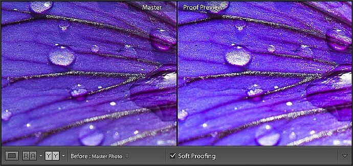
This printer loses many details in the blue-violet tones
You can clearly see that the printer has problems with the colour violet on this paper. To be more precise, it has problems with blue. The blue part in the flower is oversaturated, which means that the structure and the fine small veins of the flower are lost, just as we saw in the relative colour transformation in episode 7. This is confirmed when you activate the Gamut Warning by holding the mouse over the small icon in the upper right corner of the histogram.
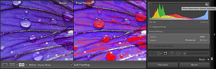
The Gamut Warning highlights colours that the printer cannot print
When the Gamut Warning is enabled, a red overlay identifies the areas in which colours are used that the printer cannot print according to its profile. If you were to leave these areas so oversaturated, this would result (as can be seen in the proof preview) in these areas appearing muddied when printed. If this only affects small dark corners, it does not matter, but if, as in this photo, the structure is an important part of the subject, the result will not look very pleasant.
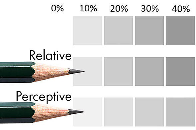
If you do your own printing, and preferably from Lightroom, the first thing you could do is to change the priority between perceptual and relative and choose which of the two conversion methods you like better. In this case, perceptual provides the better result with the print preview closer to the original.
If you give your images to someone else for printing, they will convert the images using the priority relative (in any case, I don’t know of any provider who chooses to offer perceptual as a conversion method). Accordingly, in this case, you should choose relative to ensure you achieve the right result.
Making colours printable
To get to the gamut of the profile, you have all the Develop module tools at your disposal. For example, you can change the contrast or colours over the whole image, or you can use the adjustment brush to just rework individual areas, as required. The saturation option on the ‘HSL/Colour/B/W’ tab is very practical when editing the soft proof. As in my example, a particular colour is often oversaturated. Instead of reducing the saturation for the whole photo and therefore for all the colours, it is a good idea to use the HSL tab to tone down just the one colour. To do this, I use the tool on the HSL tab. I click an oversaturated area with the tool and reduce the saturation by dragging the mouse downward while pressing and holding the button.
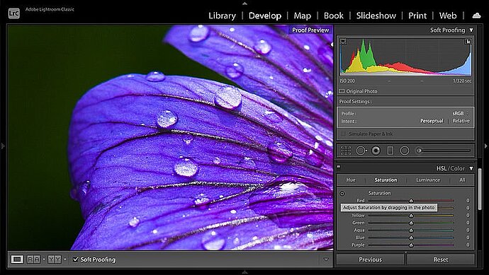
Adjusting a colour with the HSL tool
Sometimes, it may be better to adjust the hue or the luminance instead of the saturation in order to subdue the oversaturated areas. Or, it may be preferable to use an adjustment brush to correct only a small area instead of all the colours in the image. I try out different tools until I decide on the path that I think delivers the best results. As is the case with all photo editing, I sometimes look at the whole picture to get an overall impression and sometimes at the details to see what’s happening there.
I have toned down blue and purple to make sure the printer does not lose any details.
In this way, I can emphasise the fine structures of the flower again as they appear on the screen and also achieve a comparable colour impression. I will never obtain the bright colours shown on the screen, particularly with the matt paper chosen here, but the result will look much better after the adjustment than if I had printed the picture as it was edited for the screen.
Besides these colour adjustments, I almost always increase the clarity a little for my prints. A print always loses some detail contrast compared to the screen, and adjusting the clarity is the ideal way to compensate for this. Sometimes it is also good for the image if you lighten it up a little for printing, that is, increase the exposure a bit, or perhaps even just increase the shadows a little so that more details come to light in the dark areas. If there are no important details in the dark areas, it may be good for the print if you make these dark areas a little darker so that it is richer in contrast, that is, you need to drag the Blacks slide bar a little to the left. The edits you make are always a matter of taste. You will probably need to experiment a little in order to get to your personal favourites. None of these changes will be huge; you may just need +5 more clarity, +0.10 more exposure and a minimal adjustment of a chromaticity – perhaps you’ll need even less.
Printing from Lightroom
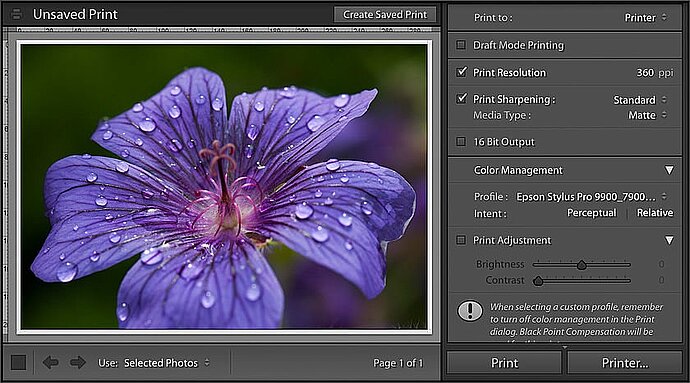
Once you have prepared your photo for printing, you can switch to the Lightroom Print module. Here, Lightroom will suggest the settings that you had when you edited your soft proof. Either Lightroom or the printer should carry out colour management, but definitely not both. I recommend that you let Lightroom perform colour management, as otherwise the colours are usually sent to the driver reduced to sRGB before printing.
When you print in Draft mode, the thumbnails are used and your photos are not newly developed again for printing. This makes printing faster. This is useful if you are printing an overview of many images. I do not use this for printing a single image. The print resolution should match the printer; this is usually 360 ppi for Epson and 300 ppi for HP and Canon. Here, you should not be confused by the fact that printer manufacturers such as Epson advertise at 2880 ppi. Only 300 ppi or 360 ppi is expected for print data. Some printers allow you to specify a setting in the depths of the printer driver that will let it accept double the resolution, that is, 600 ppi or 720 ppi. It is questionable whether this is worthwhile. You could also untick the Print Resolution checkbox and let the printer driver take care of the resolution. However, the results will be better if Lightroom ensures the correct resolution. Here, I also enable Print Sharpening and set the appropriate media type.
If you are using colour management and have a calibrated screen that is not too bright, you should not need the Print Adjustment section in this dialogue. It has been specifically integrated for users whose screen has been set to be much too bright and high in contrast so that they can adjust the print according to how it appears. In my eyes, this is a crutch to compensate for a poorly adjusted screen, but if your prints are always too dark, you could use these slide bars to compensate for this.
If you do not print yourself, but pass on your print data, you should not go via the Print module. Although you can select JPEG file as the output in the Print module, Lightroom will then also export the margin in order to get the image to fit the paper size. Printing companies, however, expect the image data without a margin, as it is usually printed together with other data on larger sheets of paper or rolls. In this case, it makes more sense to export the image in the appropriate dimensions for printing.
When printing you should let Lightroom take care of colour management
Exporting for printing
To forward my images to a printing company, I usually export them. To do this, I call up the export dialogue, enter the size of the print in cm and the resolution the printing company expects. Usually this is 300 ppi (even for those who print on an Epson, which expects 360 ppi from the device). To ensure quality, I recommend at least 70%. If the file size is not important to you, you can also take 100% or even use TIF as the file format. For simple prints, you should use sRGB as the gamut, as more extensive gamuts than sRGB are not supported for conventional prints anyway. If the printing company supports gamuts, you can of course also use Adobe RGB or ProPhoto RGB, in the hope that this will also come across in the prints. If the colours of your print look dull afterwards and you had used Adobe RGB, the printing company may have ignored the gamut and assigned sRGB to the image.
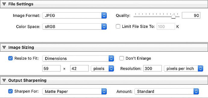
When exporting I specify the dimensions and resolution of the printer
Finally, you need to specify that Lightroom should sharpen the output and indicate whether the print should be on matt or glossy paper. Above all, make sure that the size of the print in cm and the resolution are correct. This will give you an exported file that you can send to your printing company.