Building on the last article about colour models, this article will discuss the differences between the different RGB gamuts.
People often confuse colour gamut and colour model. RGB is a colour model, but not a colour gamut, while sRGB is a colour gamut within this RGB colour model. For that reason, when people say ‘Give me the file in RGB’ or ‘Transfer this image to CMYK’, it’s equivalent to standing at a ticket counter and saying: ‘I want a ticket to a city.’ – ‘Yes, but which one?’. You need more than the colour model, you also need the specific colour gamut.
Episode 03
Differences between the RGB gamuts
Colour management for photographers

Advantages of Adobe RGB over sRGB
sRGB is designed to share images between different devices, so why would you need Adobe RGB or even ProPhoto RGB? As someone once said: ‘sRGB can display 16.7 million colours. Adobe RGB can also display 16.7 million colours. So what’s the difference?’. The answer is very simple: We are not talking about the same 16.7 million colours. My (coloured) pencil examples each had five colours, but the coloured pencil produced darker colours than the pencil. The pencil could not produce the darker colours of the coloured pencil. It is also the case with the different RGB gamuts: Adobe RGB can display colours that sRGB cannot display. If we look at the image showing a sky with clouds, the third using sRGB cannot render the blue of the sky as brightly as Adobe RGB, while CMYK printing still can (of course, you can only see the differences if your browser has reasonable colour management and your monitor can display these blue hues). The blue developed applying ProPhoto RGB is even a bit more intense than the blue developed applying Adobe RGB.
sRGB has very specific chromacities for red, green and blue, as with any RGB gamut. Together with the rest of the definition, this results in limits as to which colours the sRGB gamut can display. And yes, this also means that it cannot display all colours we can perceive – something I had never thought about before. I always thought that RGB could display all colours. First of all, RGB is not a specific colour gamut but rather a colour model. And secondly, colour gamuts like sRGB and Adobe RGB can only display a portion of visible colour. This is especially true for turquoise and green, but sRGB can also not display vibrant blue and red very well. Adobe RGB fixes the errors for turquoise and green, but it, too, has shortcomings when it comes to blue and red. ProPhoto RGB is the only one that no longer has these problems, but then again it has other deficiencies.
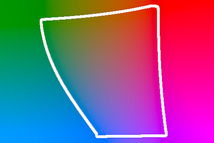
Instead of trying to show the limits of the sRGB gamut in a three-dimensional image, I will use three examples of the CIE L*a*b* gamut at brightness levels of 66%, 50% and 33%. The colours within the white border can be displayed using sRGB, the colours outside it cannot (of course, the colours shown here are only an approximation, because neither the printing press nor e-readers can display all colours of these sections of the CIE L*a*b* gamut and yes, the colour gamut is crooked and skewed, like all colour gamuts really. This is why they are usually shown as 3D models. But I find this rather confusing on paper):
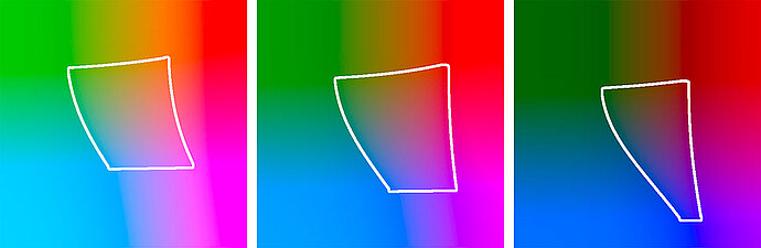
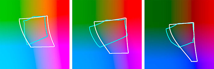
sRGB gamut at brightness levels of 66%, 50% and 33%
If your monitor were to cover the sRGB gamut, then it would only really be able to display the colours within the white border. For the colours outside the border, it shows the colour that the closest point inside the border has. Therefore, the upper left corner is covered in a uniform green, for example.
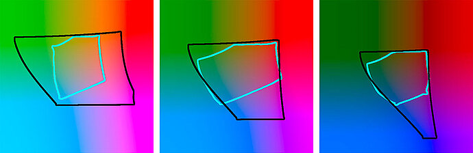
Even if I cannot show it here, our eyes could perceive colours outside this border that cannot be displayed in sRGB. sRGB can only represent a third or so of the colours that our eyes can see. We could accept the fact that there are colours in nature that sRGB cannot display. It wouldn’t be difficult. However, it is annoying that printers that work with the primary colours cyan, magenta and yellow can print some colours that sRGB does not know. It is especially noticeable with cyan/turquoise, which is unpleasant: A printer can print turquoise hues that sRGB does not know. To show you this, I have bordered the ISO-Coated V2 CMYK gamut, which is often used by printing companies, in cyan and compared it to sRGB in the following three illustrations:
sRGB gamut compared to the ISO-Coated V2 CMYK gamut
Large sections of the two colour gamuts overlap, meaning they can be displayed in both colour gamuts. The areas without overlap are more interesting. For example, there are colours that do not exist in sRGB, especially in the blue/green hues in the ISO-Coated V2 CMYK print gamut. In other words, if you prepare your image for the printer in sRGB, you cannot use these colours. I notice this with photos of turquoise clothes in particular. These clothes never look as dazzling as they do in nature on photos processed using sRGB.
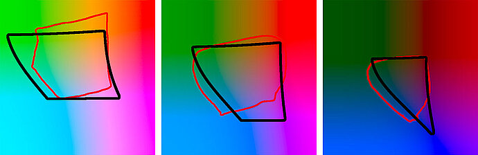
It was shortly after the introduction of sRGB that we became aware of this problem. The Adobe RGB gamut was introduced as a solution. Adobe RGB was designed to cover all the colours possible in CMYK printing at that time. Adobe RGB almost completely covers even the modern ISO-Coated V2 CMYK gamut used here. I have bordered the colours included in the Adobe RGB gamut in the following three illustrations in black, in comparison to the cyan bordered ISO-Coated V2 CMYK gamut:
The Adobe RGB gamut compared to the ISO-Coated V2 CMYK gamut
You would think that: ‘Okay, whenever I want to print a photo I should use Adobe RGB instead of sRGB, because sRGB does not contain some colours, especially turquoise and dark green hues.’
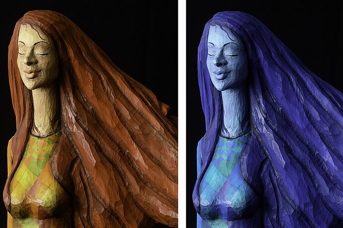
But unfortunately there was and still is a problem: sRGB had already established itself as a standard and is still the de facto standard today, almost two decades later, when it comes to RGB gamuts – to the extent that even today many programs and printing companies can only work with sRGB. You should only use Adobe RGB if you are sure that your image processing programs and your printing companies can work with it. And quite honestly, only a few know how to work with Adobe RGB! It never crossed my mind that someone might not support Adobe RGB when I first started having my photos printed in high quality. I got my first print on canvas from a local supplier who had a high-quality HP printer onsite. I was very disappointed with the result and blamed the canvas. The picture looked fine but the colours were languid, and because of the weak colours it just looked washed out. This happens when you give a service provider a file in Adobe RGB, but they cannot work with it, expecting to receive a file in sRGB. The colours are about right, but look pale and washed out. As an example, here is a photo of the lighthouse of the island of Amrum on Germany’s North Sea coast.

Adobe RGB correctly interpreted

Adobe RGB not considered
The colours are similar, but in the version in ignored Adobe RGB they shine less, because the printer in this example cannot handle this colour space. This is most noticeable in the red of the lighthouse, but the blue of the sky also shines less and even in the green some colour is lost. The same happens if you view or even edit the file in a programme that cannot handle colour spaces.
This leads to an important discovery: Only use Adobe RGB with programs and printing companies that can work with it! I have now decided to keep my hands off low-cost printing companies in general, because their results are never what I expect.
Incidentally, you can make a mistake with printing companies rather often. I thought that since the companies I use are high-quality service providers, they will definitely be able to handle Adobe RGB. But even then, not every company could live up to this expectation. It even happened that sometimes it worked and sometimes it didn’t. And even the printing companies that accept Adobe RGB often don’t use the extended colours – an appalling thought (I’ll get back to this later in the series).
Another area where Adobe RGB is appropriate is for rendering on wide-gamut monitors. These displays are characterised by the fact that they can display colours beyond the scope of sRGB. If you want to prepare your photos for these displays, it would make sense to use the extended colour gamut, of course. Sometimes calibrated monitors can even display colours outside of Adobe RGB. Just a small tip: The fact that a monitor can display colours that are outside of sRGB does not mean that it can display all colours that are within sRGB. For example, some monitors can display very intense red hues that are far beyond what is possible in sRGB, whereas they are still not able to display all blue hues that could be displayed in sRGB.
What purpose does ProPhoto RGB serve?
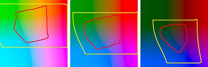
I personally don’t own a suitable printer, but rather I look for printing companies that work with high-quality printers and are able to handle colour gamuts correctly. The Epson Stylus Pro 9900 is typical printer in this regard. I have drawn the colour profile for my favourite paper Hahnemühle Photo Rag in red (the black border is still Adobe RGB) for this printer:

Are these yellow hues still a part of Adobe RGB?
I personally don’t own a suitable printer, but rather I look for printing companies that work with high-quality printers and are able to handle colour gamuts correctly. The Epson Stylus Pro 9900 is typical printer in this regard. I have drawn the colour profile for my favourite paper Hahnemühle Photo Rag in red (the black border is still Adobe RGB) for this printer:
The Adobe RGB gamut compared to the Epson Stylus Pro 9900
The Epson can print colours that are not included in Adobe RGB, such as some light yellow and orange hues and some green and turquoise hues in the mid to dark ranges. Since I absolutely don’t want to miss out on any colours and I’m relatively certain that this image contains such yellow hues, I will use a wider colour gamut that covers these colours, as well. That would be ProPhoto RGB, which I have drawn in yellow in the following three images and show in comparison to the Epson printer:
The ProPhoto RGB gamut compared to the Epson Stylus Pro 9900
ProPhoto RGB is generously dimensioned and able to cover all colours that this printer can output. Therefore, ProPhoto RGB is my choice of working colour space when I have photos printed out as fine-art prints. However, I have found that even fewer printing companies support ProPhoto RGB than those that can use Adobe RGB, and even those who do accept it produce different results. If the printing company does not recognise ProPhoto RGB or cannot process it, the result will show distorted colours. On the left you see the normal image. On the right you see the image as if it was sent to the printing company in ProPhoto RGB and was interpreted by this company as sRGB (that is, they assigned the sRGB gamut to the photo):

ProPhoto RGB correctly interpreted

ProPhoto RGB not considered
The colours are duller and they sometimes deviate slightly from the hue. Some other companies recognise and process these extended colour gamuts, but not in a way that I would have expected.