After having described the issues with colour gamuts in the previous article, we will now focus on how colour management works in general. As described in the article about profiles, each device has its own colour gamut, its own profile. This applies not only to pencils and printers, but also to cameras and monitors. Whether camera, monitor, or printer, every device renders ‘red’ as a slightly different red hue. It is necessary for us to intercede in order for all devices to display colours in the same way. This interceding is called colour management.
From capturing an image to printing it, the process involves the following steps where some kind of colour management will take over:
Episode 05
What does colour management do?
Colour management for photographers

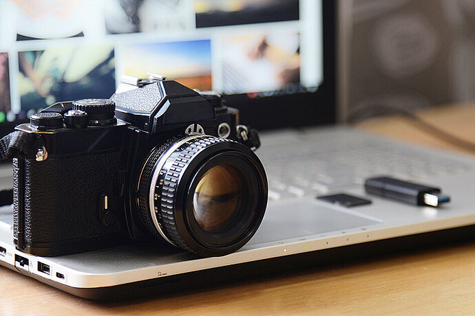
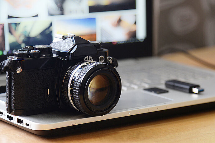
Recording with a camera
Each camera sensor captures colours slightly differently. There can even be variations between identical models due to technical tolerances. If you take a photo in *.jpg or *.tif file format, the colours of the camera sensor are converted into sRGB or Adobe RGB using a profile stored in the camera. This should actually be called a recipe instead, and not a profile, because most manufacturers do not convert the colours in a neutral way. Instead, they already give the image an appearance using colours in the camera, which many viewers like better than a neutral conversion. Of course, colours outside of the colour gamut are lost when shooting in *.jpg format. Or to be more specific: Say ‘goodbye’ to turquoise and vibrant colours in *.jpg right from the start.
Photos taken in *.raw format mean that the raw data captured by the sensor are saved as *.raw files without conversion and without a profile, that is, in a ‘raw state’. A *.raw image file contains all colours that the sensor can capture, but without any information on how to render these colours, that is, without a profile.
Opening files using image processing software
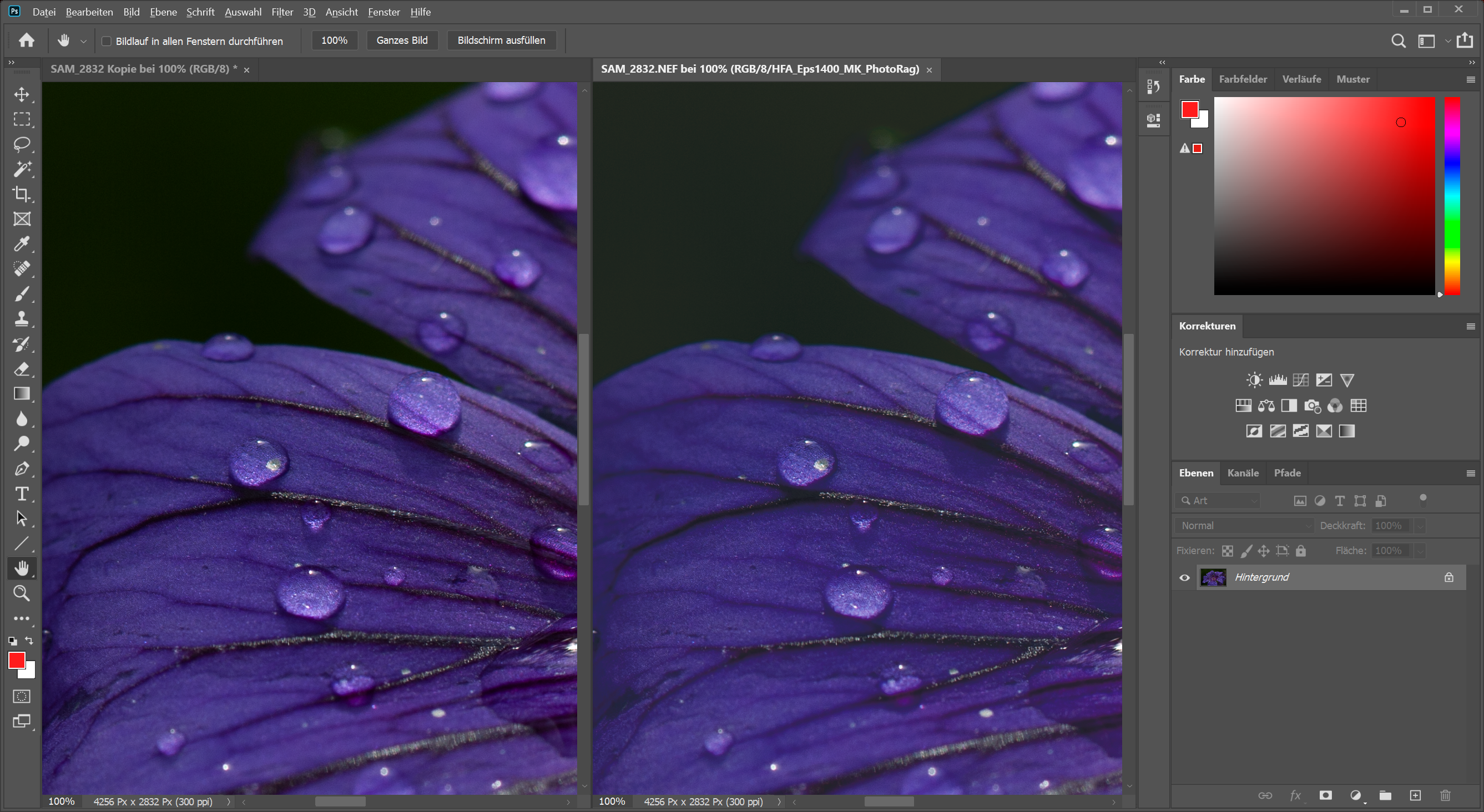
Decent image processing software takes the colour profile into consideration when opening a *.jpg or *.tif file. Either the software leaves the image in the uploaded colour gamut or it converts it into a working colour space. For example, Lightroom converts incoming images to its working colour space Melissa RGB (a variant of ProPhoto RGB). In Photoshop, you can choose whether the image should remain in its colour gamut for editing or be converted to a freely selectable working colour space. Unfortunately, there are also several programs, especially image viewers like IrfanView, that ignore the profile and upload the image data into their memory without interpretation. This can be feasible for image files in sRGB; however, rather not for other profiles.
In order to read *.raw files, the image data of the sensor must be interpreted (although image viewers like to play games here and simply display a *.jpg preview image stored in the *.raw file and created by the camera by recipe). The image processing programme must interpret the colours itself since *.raw files do not contain a colour profile. To do so, the manufacturers of the *.raw developers create a separate colour profile for each camera model, which is then stored in the software. When new camera models are marketed, the software manufacturer needs to first create colour profiles for these cameras so that the *.raw files can be imported. Even if a vendor-independent *.raw format such as *.dng is used, a colour profile for this camera model is needed to ensure that the colours are correct. It is possible that the colour profiles for a model series are not correct due to technical variations, so there is the option of creating customised colour profiles for specific cameras. I will explain in a later episode how this is implemented. The colours are converted to the working colour space once they have been interpreted. No processing is ever done in the camera’s colour gamut.
The working colour space
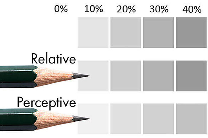
I do not always use the widest colour gamut, ProPhoto RGB, when working in Photoshop or other programs where I can freely select the working colour space. I sometimes choose my working colour space according to how I plan to use the processed image. It makes no sense to edit more colours than will be used afterwards. Some retouchers like to work in the CIE L*a*b* gamut, but that is a very special case. With programs like Lightroom, where I cannot even select the working colour space, I like to work in soft proofing to ensure that the image appears the way I want it to in the target colour gamut. I will also explain how to work in soft proofing in a later article.
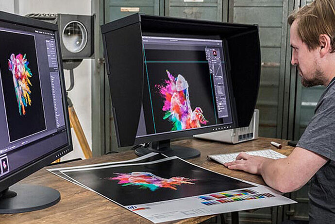
Displaying images on the monitor
Commercially available monitors expect to receive the image data in sRGB, whereas wide-gamut monitors with an extended colour gamut expect to receive the image data in Adobe RGB. However, manufacturers of monitors for office use or computer gaming make no effort to comply with a specific colour gamut. Their main focus is on having the colours be vivid. The only manufacturers that make an effort with the colours are those that market expensive monitors for image processing. In the high-end sector, some manufacturers even calibrate every single monitor at the factory, like EIZO with its CG series.
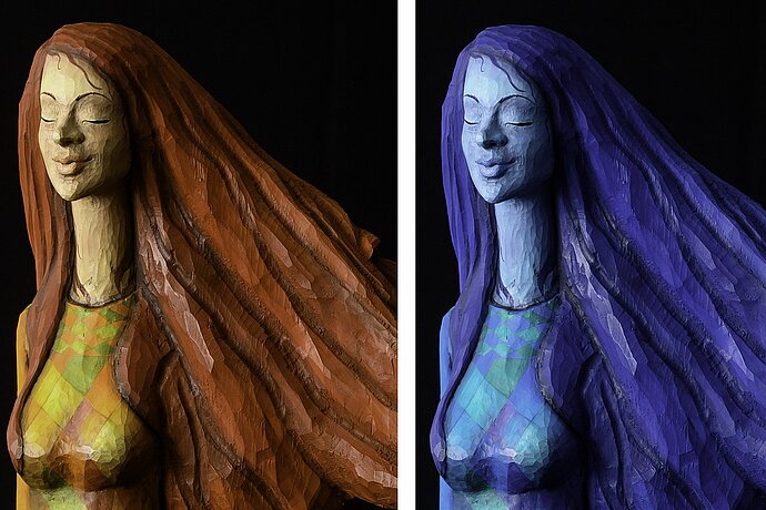
Programs that do not feature display colour management send the image data to the monitor in their working colour space without conversion. It then depends on the monitor as to how well the colours are displayed. If this sRGB image were to be displayed on an EIZO CG screen or a Surface Pro tablet, where every single device is calibrated to sRGB at the factory, the colours would be correct. However, if the image is in Adobe RGB and were to be displayed on the sRGB display of the Surface Pro without taking the profile into consideration, the intensity of the colours would not be correct and the colours would appear pale. The same applies if the contrary is true. If the programme were to send sRGB data to a wide-gamut monitor that expects to receive Adobe RGB, the colours would not be correct. They would show excess saturation. With office monitors, the colours would probably never be correct without a screen profile, because it is unlikely that simple monitors really comply with a colour profile such as sRGB. Either way, a monitor that expects to receive sRGB will never be able to display colours outside of sRGB (much to my dismay when I look at the images in this book here on my tablet instead of on an EIZO monitor).
I created a profile for my monitor with a colorimeter and stored it in my operating system, or monitor, in order to reliably display colours correctly and to take advantage of the extended colour gamut. To make this work, I only use image processing programs that comply with and support this profile. The image processing software converts the colours into this screen profile and sends the converted data to the monitor to display the photo. Programs that do not take this profile into consideration will display the colours incorrectly. But the programs that can handle this profile provide me with my monitor’s full colour gamut and I can rely on the displayed images.
A note about low-cost monitors: Even though I write here that most monitors expect to receive sRGB, it does not mean that they can display the full colour gamut. 100% coverage of the sRGB gamut is only possible when using expensive monitors that are specifically designed for image processing. Manufacturers of low-cost monitors might include support for sRGB in their specs, but they do not write that the monitor only supports this to a 70% to 90% degree. What’s even worse are the monitors whose colours change depending on your viewing angle. If you move your head slightly to the side or up or down in front of such a screen, the colours change. These monitors display an area of solid colour like a gradient. It does not help calibrating the monitor. With such a monitor it will still be impossible to properly assess the colours.
Saving
I save the images in a colour gamut that is suitable for using them at a later point in time. I described in my article about RGB gamuts which colour gamuts I’m referring to here. In Photoshop this is usually also the colour gamut in which I edit the image. In Lightroom I export it based on the subsequent purpose.
If you are using bad image processing software, it will save the photo without a colour profile. Any programs you use subsequently do not know the image’s colour gamut and, as a consequence, you cannot be sure that the programme is really displaying the image with the correct colours. Your best chance is probably by using sRGB, but it depends on the image data’s original colour gamut. Photoshop usually queries the user about how the colours should be interpreted when opening a file without a colour profile.
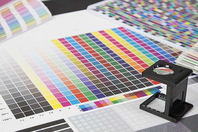
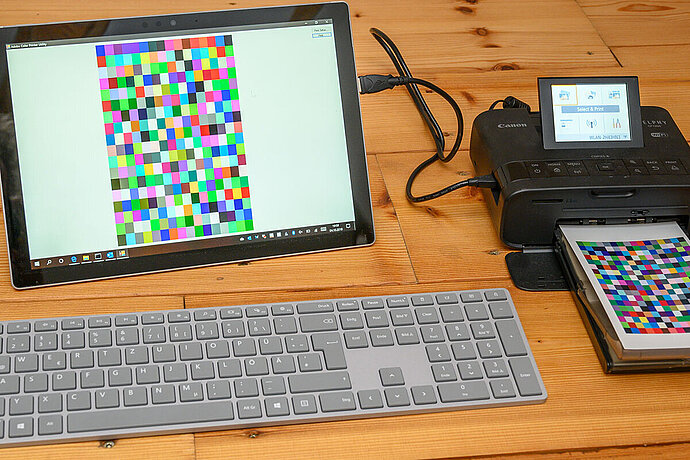
Printing
I use an output profile for the printer that is specific to the type of paper on which I will be printing. I manually select this output profile, because the image processing software cannot detect the paper that is in the printer. This leads the image processing software to convert the image data in this output colour gamut and send it to the printer. In addition, I usually have to configure the printer driver so it does not implement any colour management, because the data is pre-processed by the image processing software.
Print management software without colour management spool the data to the printer just as it is stored in the memory, and the printer driver is set by default to handle colour management. In addition, the printer driver is configured such that the driver knows which colour gamut will be used for the image data – usually in sRGB. If the working colour space of the programme matches that of the printer, the result should be fine. If not, then the colours will deviate again.
When I write ‘The colours will deviate’, it does not mean that green will suddenly be red. The colour usually only deviates slightly; a green may become a little more yellow or move into the turquoise range, and red might get an orangish hue. More importantly, if an incorrect colour gamut is used, however, the intensity will change. All the colours will be paler or oversaturated, because saturation is the most visible difference between the colour gamuts.
Every step is crucial
Colours can be lost or distorted at each one of these points. Each time the image’s colour gamut is converted to sRGB, all colours outside of this colour gamut are lost. It is most noticeable with sRGB, although the same applies to Adobe RGB. This is especially troublesome when all colours from image capture to processing are retained until being lost just before printing. But it is a problem at every juncture if the colours are not displayed as desired. Interestingly enough, I only really noticed this when I started to print more and more photos. You’ll notice colour errors much more readily when they are in print rather than on the monitor.
Colour management means control
Colour management means making conscious decisions at every point in the chain from image capture to print and controlling how colours are converted and displayed. Without colour management, there are several ways in which colours are lost or distorted. Fortunately, it is now affordable to create separate profiles for each of the devices involved (camera, monitor, printer), thus enabling you to obtain the best possible conversion at any point in the system.
The crux of colour management is image processing and display programs that support both colour profiles in image files and screen profiles. Without this support, there is no means to be able to exert control over colour management. This often leads to surprises if someone uses a fast photo viewer out of habit, which does not support either file profiles or screen profiles and, as a consequence, displays inaccurate colours.

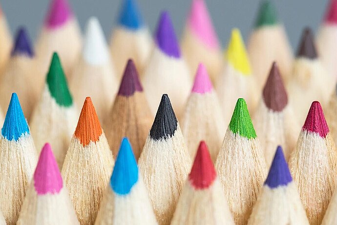
You can find many colours in nature that cannot all be reproduced in print
When is colour management not necessary?
Interestingly enough, there is a way to get on quite well without colour management: by configuring all devices to use sRGB. If the camera delivers the images in sRGB, and both monitor and printer expect to receive their colours in sRGB, then the image processing software does not need to support colour management. After all, it is only sRGB that is transferred. Fortunately, this is the standard behaviour for many devices and software, so you can achieve reasonable colours without colour management.
But then you cannot try and calibrate your monitor to a different colour gamut other than sRGB. This is because if your monitor now expects to receive something other than sRGB, it will only be correct if you use image processing and viewing programs that support the colour profile of the monitor, that is, colour management. That’s true for Windows at least. On the other hand, the Apple OS, as far as I know, specifies that all programs support the colour gamut of the respective monitor.
One disadvantage of staying with sRGB: Only colours that can be displayed in the sRGB colour gamut can be processed. Colours that are outside of sRGB cannot be displayed with this choice. If your goal is to show your photos on the Internet or to have photos printed, then sRGB is fine. Wider colour gamuts are only really necessary if you require high-quality prints where the colours have a great impact on the image.
All your devices will need to provide the appropriate support for sRGB if you want to work without colour management and only with sRGB. Few of the basic office and gaming monitors will comply with sRGB. Instead, they would rather be as colourful as possible. Which is why it is usually better to use colour management.