When you photograph a painting, you will want to make sure that it has the same colours on the screen as it has in real life. And then, when you print it again, it should look as similar as possible to the original. This is called a colour-accurate process, which is used mainly in the reproduction of works of art.
Episode 08
Calibrate screen/devices
Colour management for photographers
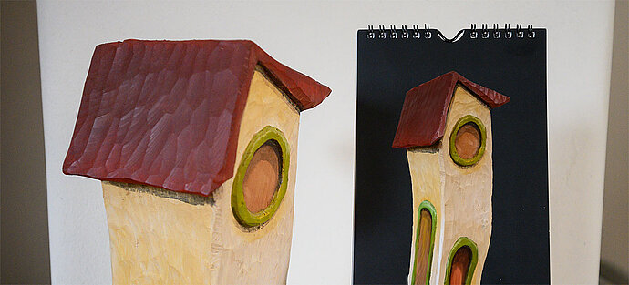
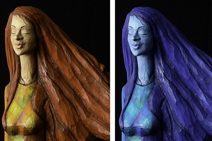
The colours of the sculpture are shown in the calendar true to the original.
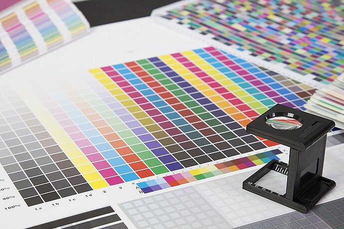
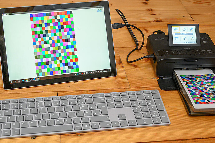
The quality of a colour-accurate process depends not only on the quality of the devices involved but also on the quality of the profiles used for them. The more accurate and up-to-date these device profiles are, the better the colours are matched. The best thing would be to create a tailor-made profile for each device and update it regularly. In general, profiling is carried out by getting the device to show a colour and then measuring with a measurement sensor to see how much the displayed colour deviates from the desired colour. With cameras and scanners, you take a colour chart and compare the result with the values expected for the colour chart. These deviations are measured over many colours and a profile is created for the specific device. The higher the quality of the measurement sensor and the more colours are measured and therefore entered into the profile, the more accurate the result will be.
There are photographers who say ‘It will never be perfect anyway’ and so reject any form of calibration. But I think screen calibration, in particular, is very useful. Because even if the colour representation may not be perfect, it will still be better than if no calibration is used. Everyone must decide for themselves how important colours are to them. Perhaps the sRGB conversion provided with your devices is very good and no further calibration is necessary. If you want to be really sure, you should check this by calibrating the devices.
Profiling and calibration
As people sometime get confused by the terms profiling and calibration, let me clarify: Profiling is the measurement of a device (in order to create a profile) and calibration, on the other hand, involves adjusting a device. In other words, if you just profile a screen, you create a profile, but you do not change the display of the screen. The data obtained from profiling is only applied to the screen display once you also calibrate the screen. Usually it is clear from the context whether you are talking about profiling or calibration. These terms are therefore sometimes confused or used synonymously.
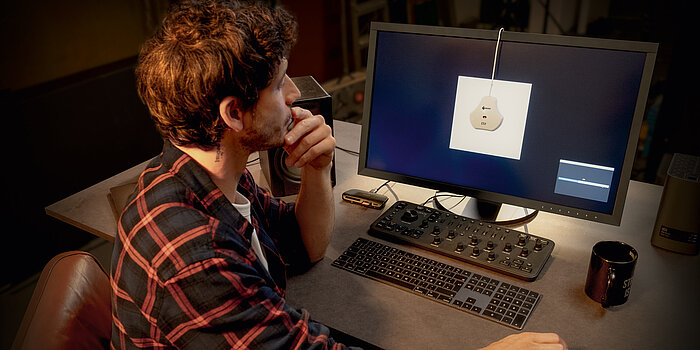
Calibrate screen
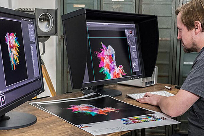
If your screen shows the wrong colours, you are more or less working blindly. Only when the correct colours are displayed on your screen during editing, can you reliably predict how the colours will look in print.
It is very important for Windows users to bear in mind that the moment you calibrate your screen, only those programs that observe the screen profile will display the correct colours! Any programme that ignores the screen profile will then display the wrong colours (and this sometimes also includes the Windows Picture Viewer and simple image viewers like IrfanView).
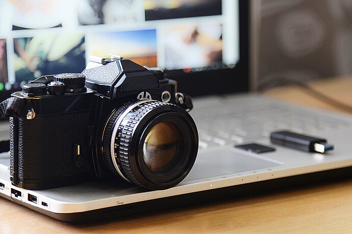
To calibrate your screen, you need a suitable programme and a colorimeter. Usually, you buy these colorimeters in a package with a suitable programme, for example, the i1Display Pro or the Spyder4. In the case of high-quality screens, you will also sometimes find programs for screen calibration that are adapted to the specific screen. EIZO, for example, provides the ColorNavigator software for its ColorEdge series that performs the calibration directly on the screen and can therefore deliver better results. The programs of monitor manufacturers, such as ColorNavigator, work with various common colorimeters. Some very high-quality screens even have a built-in colorimeter that they can use to carry out the calibration fully automatically.
To calibrate your screen, you need a suitable programme and a colorimeter.
The procedure is quite simple for all programs. The programme displays a colour, measures with a colorimeter how much the displayed colour deviates and calculates a device profile from these deviations.
The programme asks for some key data in advance for the profiling.
White balance
Daylight changes the colour depending on the weather conditions and the time of day and illuminants shine in very different colours – just think of the yellow light from a bulb, blue LED light or greenish neon tube light.
It is therefore common practice at the pre-press stage to have a so-called standard light box next to the monitor in which prints or objects can be placed to help assess the colour. If you then look back and forth between this standard light box and the screen, it is important that the same white balance and therefore the same colour temperature is set for both, as otherwise everything would briefly appear with a colour cast when looking back and forth until the eyes have become accustomed to the new white balance. These standard light boxes are usually available in the colour temperatures of 5000K or 6500K. When it comes to standard light, we also speak, in short, of D50 or D65.
When calibrating screens for the pre-press stage, you set the white balance to match the standard light. Usually, you also equip the whole room with the same light colour so that your eyes always see the same colour as white when switching between the screen and paper.
This effort is worthwhile at the pre-press stage, as the editors there spend a lot of time looking back and forth between the screen display and printed material. Photographers, on the other hand, tend to work only on the screen, without comparing and looking to see what a print next to the monitor looks like. I therefore consider an exact correlation to be excessive for photographers. If you look at the screen for a longer period of time, your eyes get used to any unnecessary colour that may exist, and above all, as a photographer you rarely have to compare the screen display with a print lying next to the monitor. In addition, most photographers will probably work in a room with windows and not just under artificial light. Also, the daylight coming through a window changes its white balance according to the time of day. This makes it difficult to determine a permanently suitable value here. In my opinion, a value for the white balance that roughly corresponds to the ambient light is sufficient for photographers to ensure the display on the screen does not appear with unnecessary colour at first glance.
Calibration software usually suggests 5500K for photography, which seems to work quite well technically with indirect sunlight. Some image processing guides consider 6500K to be more suitable, without explaining why. If your calibration solution supports ambient light measurement, you can of course use it. So, if you do not have standard light lamps at your workplace, I would recommend simply adopting the programme’s suggestion.
In the case of simple screens, you have to set the white balance on the screen, where it is often called the colour temperature, colour or gamut. I would recommend that you set the value suggested by the calibration programme here. Office monitors sometimes have a pre-set white balance of 7000K and more. If you then set it to 5500K, you will briefly feel that the whole screen has turned yellowish – give your eyes a chance to get used to it!
In the calibration programme, then select the value set on the screen or ‘Native’.
Artificial light is available in many different colour temperatures.
Native white balance
Very simple screens and many notebooks do not allow you to adjust the white balance on the display. In this case, I use the ‘Native’ setting for the white balance instead of calibrating to a specific value. The calibration software measures which white balance the display itself has and then uses this value. I prefer this setting if no colour temperature can be set on the screen itself, because otherwise the screen profile has to bend the colours strongly, which affects the general quality of the display.
Professional monitors
If you have a professional monitor such as the EIZO CG series, you do not need to set the colour temperature on the screen, as the calibration software supplied by the manufacturer can do that for you. Here, as I said, my recommendation would be to have the ambient light measured or adopt the value suggested by the calibration software – this is usually useful for photography.
Luminance/brightness
Luminance – my favourite topic – simply means the brightness of the screen. For decades, test reports have been enthusiastically referring to the maximum brightness of a screen. Manufacturers are noticing this, want their technical specifications to look good and so are building ever brighter screens. However, unless you are trying to work in sunlight, this does not make sense. Much like the white balance, the brightness of a screen should also match the ambient light. I had set my screen at work to a brightness of 80 cd/m², which is sufficiently bright after a short period of getting used to it. Low-cost screens are sometimes unable to lower their brightness that much or some then display the wrong colours. I advise you to stay in the range of 80 cd/m² to 120 cd/m². The higher the quality of the screen, the lower the luminance or brightness can be set in order to achieve a display that resembles printing. Since I installed the monitor hood on my work screen (a kind of black nurse’s cap that shields the screen from ambient light) and the window of my workroom faces north, I have even reduced the brightness to 60 cm/m², as otherwise the picture seems much too bright compared to the surroundings.
I do things differently with my notebook. Here, I select a brightness that seems pleasant to me and set ‘Native’ for the luminance in the calibration programme. Colour-correct working would be limited on this simple notebook display anyway, therefore it’s enough for me to get it approximately right. And even with this, the colours are displayed much more appropriately than if there were no calibration.
The fact that a screen profile always refers to the brightness at which measurements were taken is probably also not clear to many people. If you change the brightness of the screen, you should really also re-calibrate the profile, because unfortunately the various colours change differently when the brightness is changed. When I still used my EIZO monitor in a room in which the sun sometimes shone, I had a second profile with 120 cd/m² in case I absolutely had to work on the screen while the sun beat down in the room. I created the profiles separately from each other and I adjust each one regularly. On the other hand, I only have one profile for my notebook that I use at all brightness levels. This may not be perfect, but it is still visibly better than not having any calibration at all.
Just as with the white balance, the aim is for a print next to the monitor to appear as white as the corresponding photo on the screen. In the case of the luminance, the aim is for a print next to the monitor to appear as bright as the display on the screen.
Tone curve/gamma
Although I have not yet mentioned the tone curve/gamma, this is an important part of every gamut. It is sometimes also referred to as the gamma value or gamma adjustment, and it describes how brightness is distributed between black and white. Cameras have it easy: If twice as many light particles land on the sensor, the image is twice as bright. Our eyes, on the other hand, are more sensitive in dark areas than in light ones. If the light particles in a dark area are doubled, this appears more than twice as bright to us. To compensate, in the bright areas of an image, a doubling of the light particles appears less than twice as bright to us.
In other words, our eyes can distinguish brightness better in the dark than in the light. The tone curve, which is usually represented as gamma, reflects this behaviour in image processing.
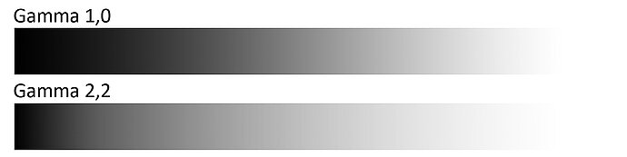
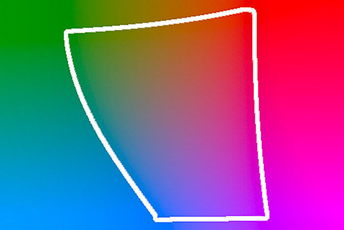
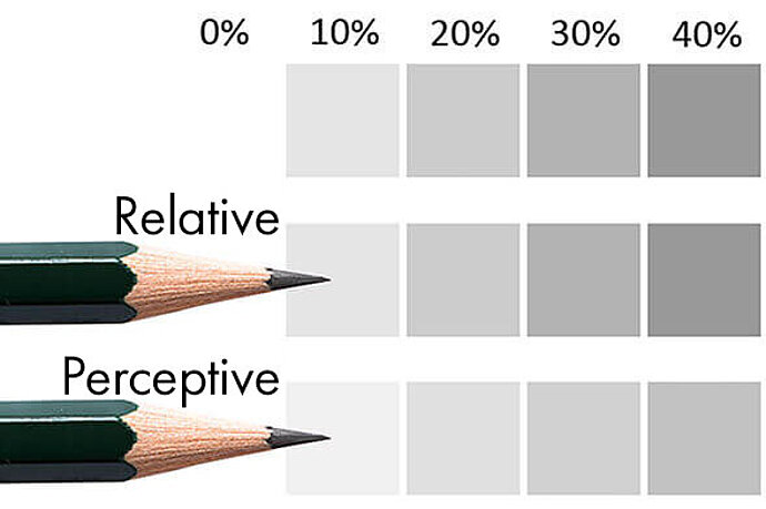
Gamma describes the distribution of brightness.
Each colour profile and each gamut contains a tone curve in order for you to be able to convert the image data not only in the colours but also in the brightness of the colours. For image processing, it is advisable that the tone curve of the screen corresponds to the tone curve of the working colour space, as then the conversion of the image data from the working colour space to the screen profile will deliver the best results. I recommend a gamma value of 2.2 for image processing. Adobe RGB uses a gamma of 2.2. The tone curve of sRGB cannot be described with a simple gamma value; it corresponds most closely to a gamma of 2.2. Lightroom also works with the gamma curve of sRGB for display. Only ProPhoto RGB differs a little with its gamma of 1.8. Nevertheless, 2.2 as a gamma value is a sensible choice for screen calibration in image processing. Apple used to recommend calibrating to a gamma value of 1.8, but now 2.2 is also recommended here too.
Some calibration solutions allow you to have other things measured and adjusted, such as the contrast ratio or automatic adjustment to the ambient light. The programme’s suggestions are normally useful here. The only thing I disable is automatic adjustment to the ambient light as I don’t want my screen to change its colour display or brightness while I'm working. I find that annoying.
Hardware calibration
The term hardware calibration often causes confusion when it comes to screen calibration. If you hear this term for the first time, you might think that when you use a colorimeter (that is, a piece of hardware), it is probably hardware calibration. Although this sounds logical, it is not true. Hardware calibration is when the monitor itself performs the colour conversion from the working colour space to its gamut and not the image processing programme or operating system. This, of course, is only possible with suitable monitors such as the EIZO ColorEdge series, for example, and programs that are specifically suitable for the monitor. In the case of EIZO, this would be ColorNavigator.
If your monitor supports hardware calibration, you should definitely use it, as this will improve the quality of the colour conversion. With software calibration, the quality of the conversion to the screen profile is poorer, which can lead, among other things, to steps in the display of colour gradients.
Multi-monitor
If you use two monitors on your computer or have a multi-monitor set-up, you should check whether the calibration solution you’d like to buy supports multi-screen operation before purchasing it. I used to have an sRGB and a wide gamut monitor running at the same time, but then my system limited colour reproduction to the lowest common denominator. In other words, the wide gamut monitor also only showed sRGB colours, which was totally unacceptable to me. But using a multi-monitor set-up also has other pitfalls. For example, if you drag a window from one screen to another, the colour display is usually not adapted to the profile of the second screen. When I work with two screens, I usually calibrate only one of them and do all work where colour representation is important on this calibrated screen.
External screen
If you use a notebook with an external screen, I would recommend setting the display so that each screen shows its own image. Otherwise, Windows, at least, will enjoy causing problems when it comes to applying the profiles. Even if your notebook display is switched off, that is, you only work on the external screen, Windows sometimes doesn’t like to apply the profiles.