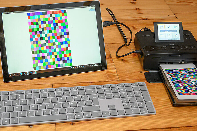
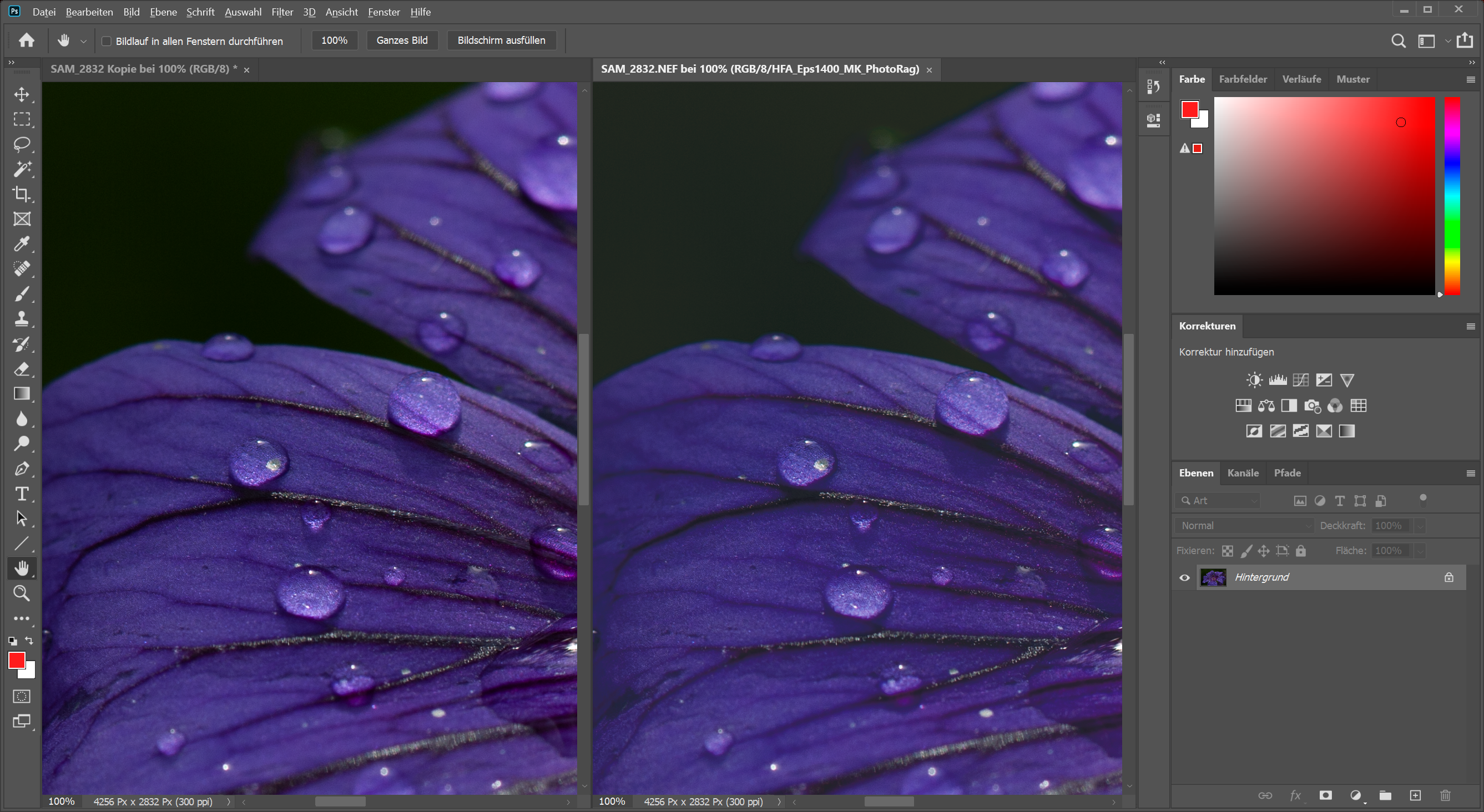
You actually only notice the effects of colour management when things go wrong, such as when a printout does not show the colours I see on the screen. Or when I hold two printouts of the same photo side by side and the colours are different. Or when my laptop shows different colours than my usual desktop computer. Or when I connect a second monitor to my computer and the colours between the two are different.
Episode 01
Reasons for colour management
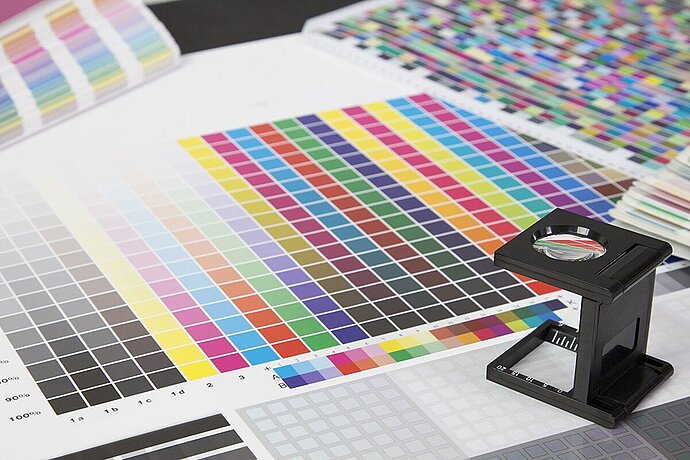
Colour management for photographers
Colour management is responsible for all these conversions of colours from one device to another.
Our computer also implements colour management even when we don’t do anything about it specifically. The operating system decides which hues are used for the chromaticity from the file, even if only one image file is displayed on the screen.
Gamut, colour profiles, colour models
You’ll need a little background information about colour gamut, colour profiles and colour models to understand colour management. These are neither mysterious nor complicated. In order to explain them, I have come up with a fictitious example for gamut to explain what it is:
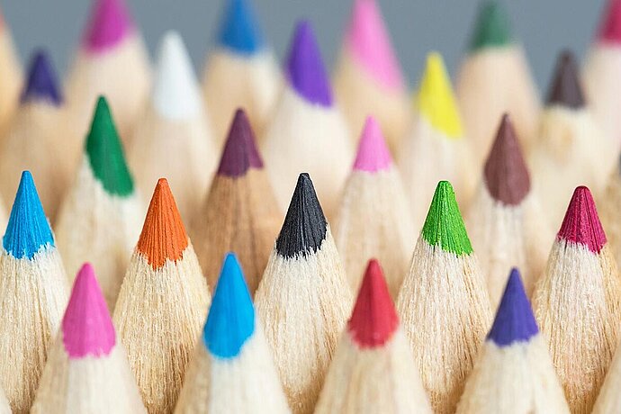
A fictional example using a pencil’s colour gamut
A colour gamut is something very simple when viewed abstractly: It tells you which colours can be mapped. To explain this, I have come up with a few examples as a comparison, which essentially do not exist, but that help explain the connections. First, a very simple colour gamut:
Which colours can be produced using pencil lines on white paper? Below you will see a few examples with different levels of opacity:
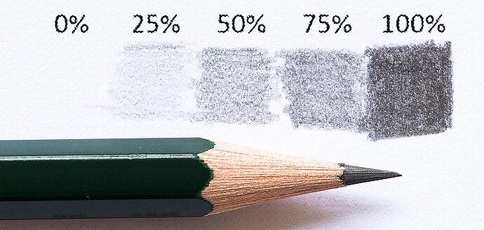
Pencil lines drawn with varying degrees of pressure
A pencil produces a dark grey line when pressed hard. If you press on it only lightly, you can draw a lighter grey with it, and it remains white if you do not press down on the paper at all. Depending on the pressure you apply, you can use a pencil to draw different grey hues.
These different grey hues are the colour gamut of a pencil (on white paper). However, it is not called colour gamut. Instead, it is referred to as colour profile (or simply profile), since the pencil is a tangible object. The pencil’s profile includes the colour gamut it can represent.
The colour profile of a coloured pencil
Now we have different types of pencils, different hardness grades and different materials for the pencil core. Each of these pencils produces a slightly different colour. For example, if I take a black coloured pencil and draw four boxes with it, the result will look different:
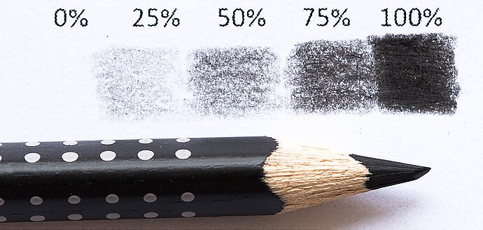
Pencil lines drawn with varying degrees of pressure using a black coloured pencil
The first pencil we used produced lines of varying shades of grey. Now, this pencil draws a nearly black one. Other writing implements would produce black in a different way (just think of a permanent marker). As we see, each pencil has its own colour gamut, that is, its own colour profile.
Colour gamut or profile?
So far I’ve only talked about colour gamut. But when it comes to something tangible, it is called colour profile. Sometimes it is even called ‘device-dependent colour space’ or ‘device-dependent output profile’. Such a profile consists of a colour gamut that this device can output. Writers readily interchange colour gamut and colour profile in many texts, but don’t let this confuse you. As I wrote earlier, colour profile is generally used for a device, and device-independent topics, such as sRGB, are usually referred to as colour gamut.
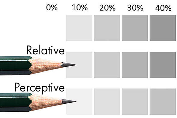
Grey levels in the printing process
My laser printer prints yet again different grey levels. If I compare the printed black produced by my laser printer with the darkest colours of these two pencils, the grey of the pencil is just 60% of the black from the printer, while the black coloured pencil is nearly 90% of the black from the printer:
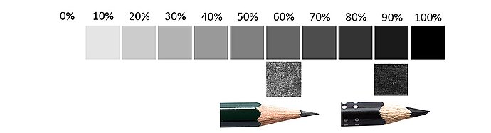
Maximum blackening of the pencils compared to the printer
My laser printer produces different gradations from grey to black – just like the pencil and black coloured pencil – and therefore has a different colour gamut and a different colour profile than those pencils.
If I were to tell you “Colour a box for me using 75% grey” now, you would have to ask: “Wait a minute, we just had three different versions of 75% grey, which one do you want? The pencil, the black coloured pencil or the laser printer?”
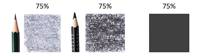
75% black looks different depending on the writing implement
That’s a very good question! After all, this question is the basis of colour management: Which colour profile or gamut are we talking about? It is something that is very important to know; otherwise, we cannot distinguish between the different reds of roof tiles or those of roses.
Everyone develops their own colour gamut
What applies to grey also applies to every other colour. Ask ten children to draw a red car for you, and you will get ten cars in different red hues. Ask ten engineers to build a colour monitor, and the ten monitors will display the reds differently.
And that puts us right in the middle of the problem that the computer industry dealt with two decades ago: Every manufacturer had its own definition of colours, its own colour gamuts. When a file was transferred from one workstation to another, every time you had to think: ‘Which computer is the file for?’ ‘How do I get it displayed correctly on my computer?’ The International Colour Consortium (ICC) was created back then to work on developing the possibility to define the colour gamut of devices as a colour profile, to save these colour profiles as a file and to transfer them together with the images. These files are called ICC profiles, and today they are being developed further and used. Modern image files like *.jpg can store these profiles directly in the image file, eliminating the need for a separate file including the profile. These colour profiles, which describe colour gamuts as I previously mentioned, are the basis of colour management.
Two basics of colour management
There are two basic things you always need to keep in mind when it comes to colour management:
Every device has its own colour profile
Every camera, every scanner, every monitor, every printer, every projector as well as every other input and output device there is – each of these devices has its own colour gamut and therefore its own colour profile. This device has been shipped with a profile ex-works that it uses (or that your programs use), even if you didn’t assign a profile to it. If you don’t deliberately select the profile yourself, it can be good or bad, but one profile or another is always used, because the data has to be displayed somehow.
Every image file has a colour gamut
Along the same lines, every image file has a colour gamut. Some files explicitly contain a profile, which is generally the sRGB colour profile. When you set your digital camera to use Adobe RGB, the first character of the name of the *.jpg file is prefixed with an underscore. For *.raw files the software selects the profile based on the camera name; screenshots are in the colour gamut that is set for the monitor. Even the image files that do not contain a profile still originate in a certain colour gamut. It’s like chocolate you can buy in the shops. Even if you don’t know where the chocolate comes from, it still has an origin. It’s only that you do not know what it is.
When a programme opens an image file, the file is interpreted using a colour gamut. If the programme is good, it imports the profile information from the file and complies with it; if it does not, the operating system interprets it with its default profile for display (usually sRGB or the screen profile). This colour gamut is called the working colour space, because the programme works with this colour gamut. You can use any colour gamut as a working colour space in image processing programs like Photoshop.
If you do not choose a colour profile or gamut, someone else will do it for you. Most of the time this will be something similar to sRGB. I write ‘something similar to sRGB’ because every manufacturer makes different efforts to meet sRGB. For example, EIZO measures its professional monitors at the factory and delivers them optimally calibrated. On the other hand, manufacturers of lower cost devices are content with having the colours be more or less correct.
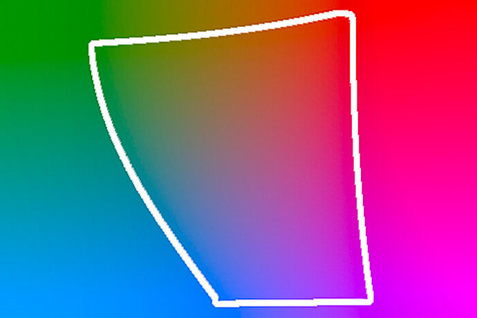
sRGB – one colour gamut for all devices
The solution by which each file is assigned its own colour profile is not bad at all. This way, any software can look it up and say ‘Ah, okay. This file belongs to the category of “drawn with the coloured pencil gamut”.’ However, in practice, it proved to be cumbersome for each file to have its own personal colour profile when ICC profiles were introduced (‘Hey, what kind of profile is Herlitz Fine-Marker T1?’). What’s more, when ICC profiles were introduced, there weren’t any image processing programs that supported these profiles. Which is why, in 1996, HP and Microsoft proposed to establish a default colour gamut whenever there was no explicit specification for a colour gamut. This was the beginning of sRGB (you can think of the ‘s’ as standing for ‘standard’ RGB, even though it was never explicitly specified what it should stand for). Meanwhile there are many other ‘standard’ colour gamuts; the most common ones besides sRGB are Adobe RGB and ProPhoto RGB.
sRGB was, and still is, a complete success in terms of acceptance. It has become widespread since its introduction. Every digital camera, every scanner produces images in sRGB by default. Nearly every factory-set monitor and software expects to receive the data in sRGB by default. Although the printing technology requires a different colour model, even normal workplace printers expect to receive their print data in sRGB.